Setting up buttons appearance
Created buttons are round and with the symbol  . Only color and label are available for changing. Advanced settings of button appearance can be implemented using style of the object which the button is added to.
By default

With styles

| Styles influence only on displaying widgets in the Standard view. |
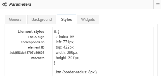
Buttons shape
Buttons can have rectangle shape or rectangle with rounded angles. To do this it is necessary to set the property border-radius to the class btn and determine the radius of rounding in pixels.
For instance, the radius of rounding is equal to eight pixels:
.btn {border-radius: 8px;}
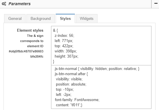
Symbols on buttons
Any Unicode symbol can be set for a button. For instance,  (f011, FontAwesome font family):
.js-btn-normal { visibility: hidden; position: relative; }
.js-btn-normal:after {
  visibility: visible;
  position: absolute;
  top: -10px;
  left: -2px;
 font-family: FontAwesome;
  content: '\f011';}