Main controls
Main controls to work with graphs are placed above the list of graphs:
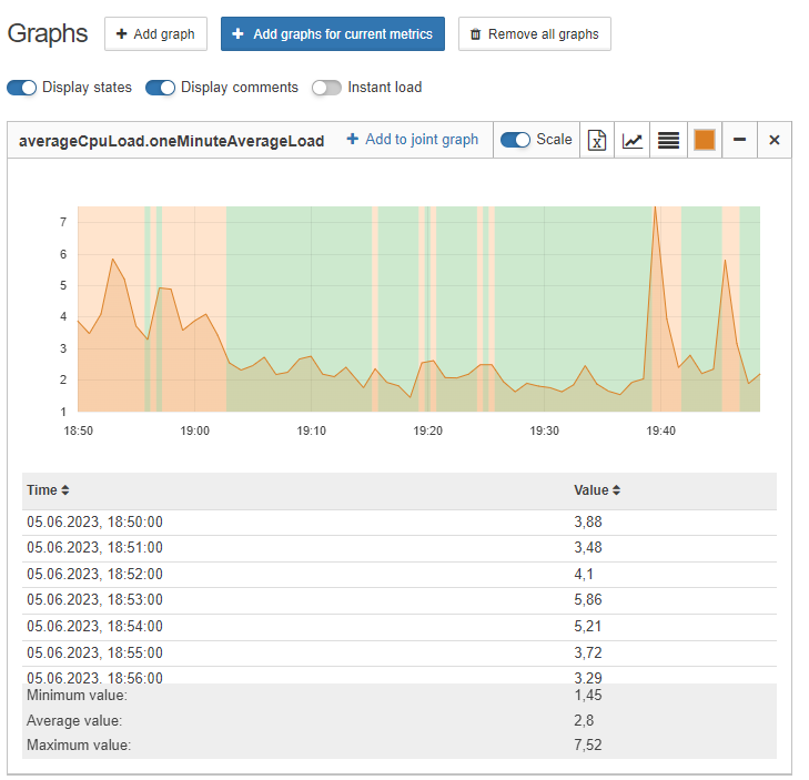
This panel allows to:
-
add new graphs;
-
add graphs for all current metrics;
-
delete all graphs from the list;
-
turn on/off displaying of object state over the graphs;
-
turn on/off displaying of user comments over the graphs;
-
turn on/off instant load mode;
-
group data by time - downsampling;
Downsampling is designed to smooth the displayed graphs. The smaller the downsampling value, the more detailed a graph, based on large amount of points, will be. It is worth to consider that with selecting grouping in one minute and plotting a graph, for example, over the past year, the plotting speed is reduced.
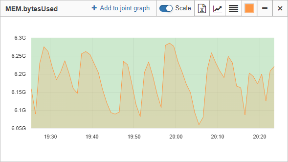
There are individual manage elements at the top right corner of chart headings.
| Button | Action | ||
|---|---|---|---|
|
Add the graph to the joint graph |
||
|
Changing scale values |
||
|
Data export, based on which the graph is plotted, in the CSV format
|
||
|
To change type of the graph: linear or histogram |
||
|
To show/hide values in the table under the graph
|
||
|
To change color of the graph |
||
|
To hide/show the graph |
||
|
To delete the graph |
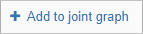


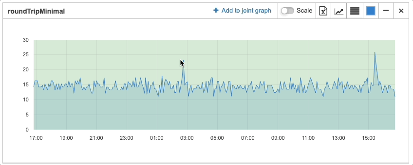
Check value on graph
To check the value at a certain point in time, hover over the necessary part of the graph.
This popup contains the value of the metric, time and date when this metric was received and state of the object at that time.
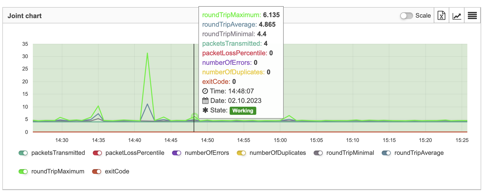
When you check values of multigraphs and joint graphs, this popup will contain every metric used to build this graph. These values are show in descending order.
Scale values
By default, the scale of values on graphs starts with zero. Scaling values allows to bring a graph closer, it makes parameter changes more noticeable:
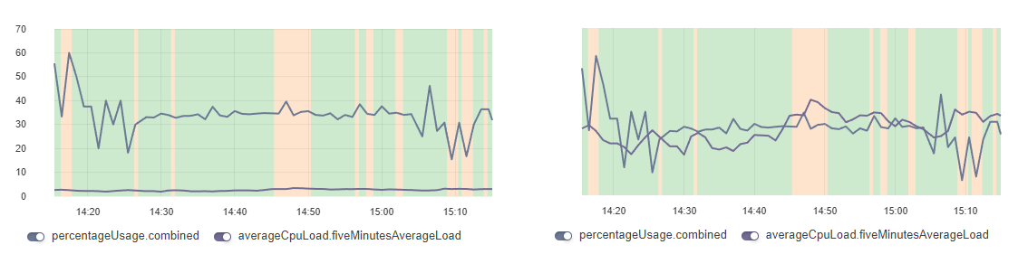
For multigraphs the scaling values option allows to clearly compare data with different dimensionality.
For example, CPU load is checked and the metric averageCpuLoad.fiveMinutesAverageLoad with 0-4 range and metric percentageUsage.combined with 0-100 range are received. In this case the graph averageCpuLoad.fiveMinutesAverageLoad will be a straight line because of its tiny range comparing to the percentageUsage.combined one. The Scale values feature allows to normalize values of such metrics from different objects for their better visualisation and understanding.
| Values are not displayed on the vertical scale of scaled multigraphs. To view the data hover the mouse cursor over the graph. |
Time range selection
You can also select the graph’s time range using the Widgets time range menu.
The time range can also be selected by dragging your mouse across the part of the graph that you want to zoom into.
| Use the Widgets time range menu to reset the time range after selecting it with a mouse. |
If the selected time range has no data to build the graph from, a message "No data for the selected range" will be displayed instead of a graph.