Grid view
|
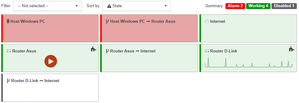
In the section gridView of the client configuration file it is possible to set up:
|
Object displaying and sorting
There are two drop-down lists above the grid:
-
Filter:
A list of states can be set here. Only the objects and links in one of the specified states will be displayed in the grid.The counters in the top-right corner of the screen show the total number of objects in each state, regardless of the selected filter. -
Sort by:
One of the sorting criteria can be set here:-
Name | objects and links are sorted in alphabetic order;
-
State | objects and links are sorted according to priorities of states, beginning with the most critical state.
-
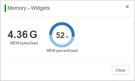
Widget displaying
There is the icon  at the top right corner of objects with configured widgets. With clicking the icon the detached window with all of the widgets is opened:
For objects with configured widgets the first widget is displayed on the object:
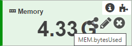
Size of the widget depends on the size of the object.
| The widgets Structure and Section are not displayed on objects. If an object has other widgets, then the next widget from the list is displayed. |
When the mouse cursor is held over the widget the following appear:
-
label,
-
icon
 (widget code),
 -
icon
 (modify widget),
 -
icon
 (remove widget).
View features
The Grid view has the following features:
-
links between objects are displayed as rectangles, similarly to objects;
-
any object, even one which is displayed as SVG-image, is a rectangle;
-
any object, even one which has an image as background, has background color which corresponds to the object state;
-
child objects are not displayed on rectangles.